

Just imagine this:
You got your sales report built, and it got hundreds of rows and tens of columns. Everything looks great, and you run the report for a specific date range and want to find a sales amount of less than $1000 and quantity more than 20. You are scrolling up and down and trying to figure that out, but there are so many rows that you lose track. Your eyes are getting stressed scanning the report, and you wish if you could just color code or add some kind of visual cues to those numbers, so they are easy to track.
If you have wanted a solution to this problem, then you are in luck because this article is a step by step guide to add visual cues or color code the columns.
We are going to use Fiscal Year date sales report to show the steps:
You can download this report for free if you subscribe to our mailing list.
Ok, let’s add the visual cues.
Open the “Properties” dialog from the right-click menu of the chart and choose the Visual Cues tab.
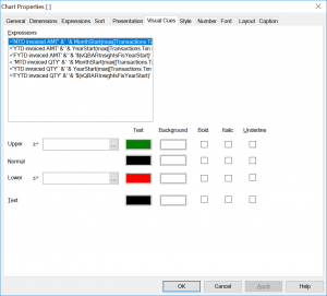
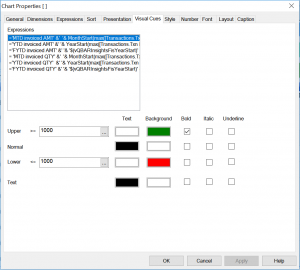
.We can choose any expression and add the rules for the visual cues as shown in the image below.
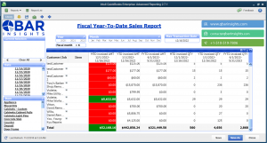
The QuickBooks Fiscal YTD Sales report looks like this.
Now here is a task for you:
Add visual cues to the 3rd expression, so the background turns to yellow and text to black only if the amount is in between 2000 and 3000.
If you want this report, then please subscribe to our mailing list.