
Did you ever need:
1. To see the combined view of “Open Sales Order report by Customer” and “Open Sales Order report by Item.”?
2. To group the open sales order either by a sales rep or any custom fields or year or month?
The QuickBooks standard open sales order reports cannot do these for you out of the box.
But, here is good news for the Enterprise users. Intuit has provided a fantastic feature for enterprise users. The feature is Advanced Reporting. And, this blog will explain the step by step process to build Open Sales Report using this feature.
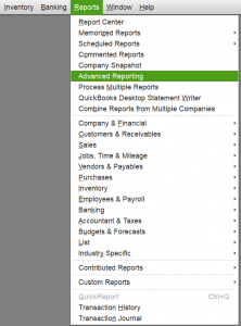
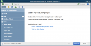
You can find the QuickBooks Advanced Reporting under the Reports menu.
If you have not used this feature before, then QuickBooks will download it and install it, when you click on it. After it has installed Advanced Reporting, then it will start extracting data from QuickBooks and build the reporting data model. Once, it has made the reporting data model; then it is ready.
So let’s start.
Open Advanced Reporting, if it the first time then wait until it is ready if it is not the first time then you can choose to update data or skip it.
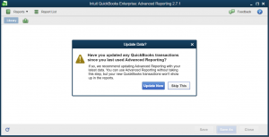
Whether you decide to skip or update, the QuickBooks Advanced Reporting will open a Welcome window before you can start working with it.
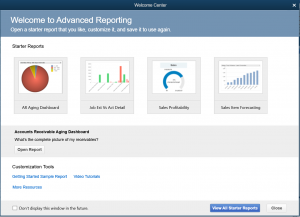
Close this window too.
You are now on this screen.
Click on the “Current Selection” in the left-hand Library section and your window should like this now.
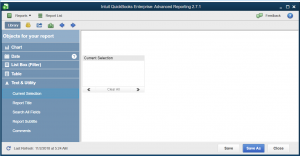
The “Current Selection” will help to clear out the applied filters.
Next, do the right click on the white area and click “Chart” as shown in the image below.
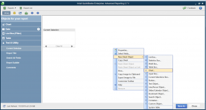
You should see this window shown below.
Choose the pivot table (shown as an enlarged icon on the image).
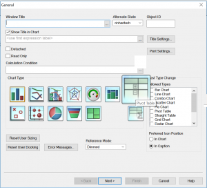
Click Next>.
The dimension tab will open up.
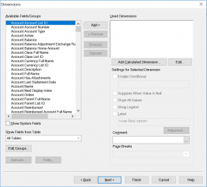
We will choose three dimensions from the left-hand “Available Fields/Groups” for this report.
The “Used Dimensions” box is showing all selected dimensions.
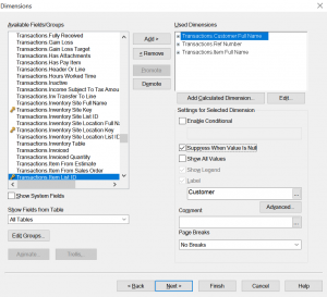
Check “Suppress When Value is Null” for all dimensions.
Also, give a name to all selected dimensions in the “Label” field.
Click the “Next>” button.
The expression window will show up.
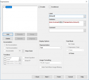
The first expression is to show the sales order amount.
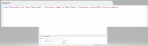
Here is the text that you can copy:
sum({<[Transactions.Txn Type]={‘Sales Order’}, [Transactions.Header Or Line]={‘Line’}, Transactions.Invoiced={0}>}Transactions.Amount)
Press Ok, and you should see this window.
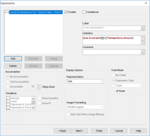
Type ‘Amount’ in the Label field.
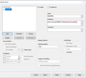
Then click on the “Add” button to add the expression for the Quantity.
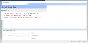
A new expression window will show up.
Now type the following expression in there.
sum({<[Transactions.Txn Type]={‘Sales Order’}, [Transactions.Header Or Line]={‘Line’}, Transactions.Invoiced={0}>}Transactions.Quantity)
Press Ok and give a label “Quantity” to this expression.
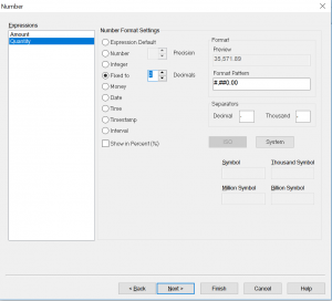
Click “Next>” five times and you will be on the “Numbers” tab.
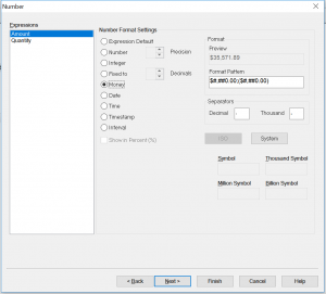
Select “Money” for Amount and “Fixed to” with 2 Decimals for the Quantity expression as shown below.
Click “Finish,” and you should have the following chart.
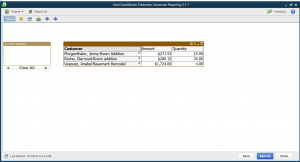
Right now report is in collapsed form.
Now, either click on each “+” sign to expand the individual lines or you can right click and select “Expand all.” as shown in the image below.
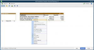
Once you have expanded both Customer and Ref#, then your chart should look like this.
The subtotals are missing so let’s add them.
Do right click on the chart and select “Properties” and go to the “Presentation” Tab.
Select “Show Partial Sums” for all three (Customer, Ref#, Item) dimensions.
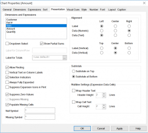
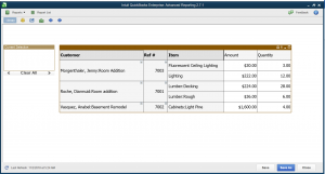
Click Ok, and your chart should look like this.
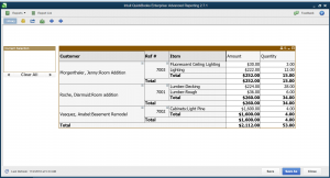
So, this is your chart Open Sales Order by Customer and Item.
Now If you need you can add as many dimensions as you want.
Just right-click the chart and open properties dialog and go the dimensions tab and choose the required dimensions like Year, Month, Sales Reps or Custom fields, etc.
Please watch this video to see all these steps again.