The monthly sales report is probably the most common and vital sales report for any business. It gives an opportunity to monitor the progress of sales goals on a consistent basis.
There are numerous templates for the monthly sales report. Each model serves a different purpose. The QuickBooks, regular sales report, provides a certain kind of template which allows to group the sales across 2 entities (One on the row and other on the column) and time periods as sub-columns.
There are indeed limitations to the customizations for the standard reports. One weakness is not to allow to add more than two entities to group the sales.
This article shows the step-by-step process to build a monthly sales report with the flexibility of adding more than 2 entities to group the sales.
So, let’s begin:
Follow these first few steps as stated here.
Select the pivot table after choosing the “Chart” from the right-click menu.
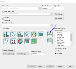
Click “Next>.”
On the dimension tab:
- Choose “[Transactions.Customer Full Name]” from the “Available Fields/Groups” list (indicated by blue arrow). Once you select it, then it shows up in the “Used Dimensions” (indicated by red arrow).
- Check the “Suppress When Value IS Null” (indicated by green arrow).
- Give a label to the dimension (indicated by orange arrow).
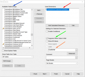
Click “Next>.”
On the Expression tab:
- Type the expression as shown in the image or copy it from here:
sum({<$(vExprSales), $(vExprPreviousNMonths(0))>} [Transactions.Amount With Sign])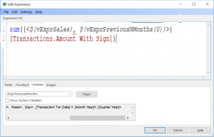
- The expression tab looks like this.
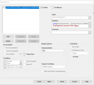
- Type the below statement in the Label.
=$(vTxtMonthYear(0))
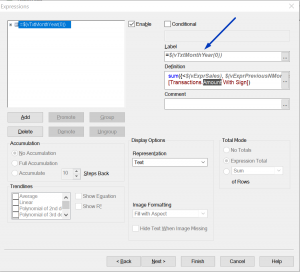
- Copy and paste the same expressions as many as a number of months needed on the report.
- To copy; right-click on the expressions and click “Copy.”
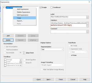
- To paste; right click on the white area and click “Paste.”
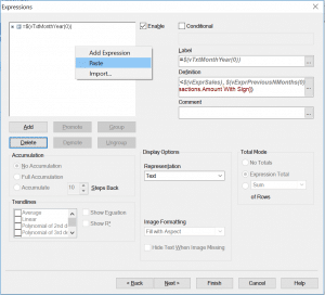
- To copy; right-click on the expressions and click “Copy.”
- Here is the expression tab with four same expressions and their labels.
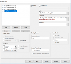
- Let’s change these expressions to represent different months.
- The month of the max transaction date of the company file:
- Expression:
sum({<$(vExprSales),$(vExprPreviousNMonths(0))>}[Transactions.Amount With Sign]) - Label:
=$(vTxtMonthYear(0)
- Expression:
- Last month:
- Expression:
sum({<$(vExprSales), $(vExprPreviousNMonths(1))>} [Transactions.Amount With Sign]) - Label:
=$(vTxtMonthYear(1))
- Expression:
- Second last month:
- Expression:
sum({<$(vExprSales), $(vExprPreviousNMonths(2))>} [Transactions.Amount With Sign]) - Label: =$(vTxtMonthYear(2))
- Expression:
- Third last month:
- Expression:
sum({<$(vExprSales), $(vExprPreviousNMonths(3))>} [Transactions.Amount With Sign]) - Label:
=$(vTxtMonthYear(3))
- Expression:
- The month of the max transaction date of the company file:
- This is how the expression tab looks like:
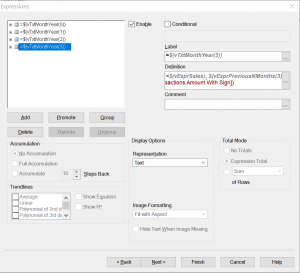
Click “Next>” two times.
On the Presentation tab:
- Select the Customer in the “Dimensions and Expressions” list.
- Check “Show Partial Sums.” This will show the subtotals.
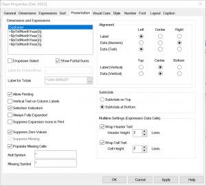
Click “Next>” three times.
On the Numbers tab:
Select “Money” for all four expressions.
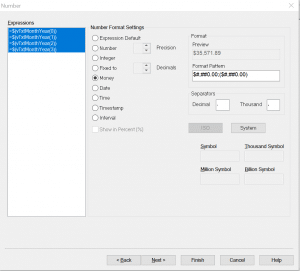
Now click on “Finish.”
The first cut of the report is ready. It shows the data for the last 4 months from the max transactions date of the company file. Since it is a sample file, so the max transactions date is Dec 2022.
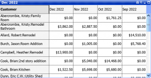
This report is built on the sample file, so the months will differ than your report.
Some color settings will also differ depending on your settings.
On scrolling to the end, there should be subtotals.
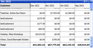
Now when the first cut is ready, let’s add Item as one more dimension to this report.
Add Item as a dimension:
- Right click on the chart and choose properties.
- Go to the Dimensions tab.
- Choose [Transactions.Item Full Name] from the right-hand lists and click on the “Add” button to add to the “Used Dimensions” list.
- Make other settings look like same as shown in the image below.
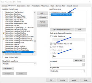
- Go to the Presentation tab and make all settings look like as shown in the image below.
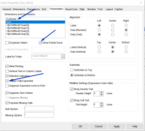
- Click Ok.
Now the report is grouping the sales amount by customer and item both.
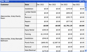
Let’s add one more dimension [Transactions.Class Name] to the report.
Just follow the previous steps:
- Right click on the chart and click properties and go to the Dimensions tab to choose [Transactions.Class Name].
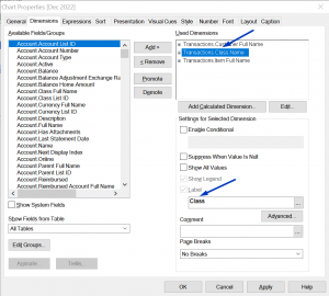
- This dimension is moved to the second place by clicking on the “Promote” button.
The “Suppress When Value is Null” is not checked because a class can be null in the sample report on some transaction line items. - Go to the Presentation tab and check the “Show Partial Sum” For this new dimension too.
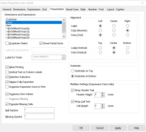
- Click Ok.
Now the report is grouped into three dimensions.
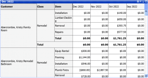
The same process can be followed to add as many dimensions as needed by your business.
You can even watch the video to learn these steps.
Let us know if you got any questions and comments.

